Resource
An Introduction to Collaborative Mapping for Transparency and Accountability
Resource
There's a common quote often seen on the Internet that declares “80% of data has a spatial component”. Finding the source of this quote is hard and it's probably safe to assume that it's been invented at some point with little to no evidence to back it up. Having said that, the quote is popular enough to survive its detractors and has been used by some big names in the geospatial world. Whether the quote is strictly true or not is not really the point; the quote is powerful because it's generally accepted that much of the data we deal with will have at least a course spatial component.
By: Joseph Reeves, Humanitarian Open Street Maps
The traditional way to present data with a spatial component is to publish it on a static map. The rise of the Internet has, of course, changed the traditional methods of publishing of all forms of media. Maps being no exception. Maps are no longer items to be published by the few and consumed by the masses; now anyone with only a limited access to technology can contribute to the processes of collecting, publishing and consuming spatial data. Not only can we use existing spatially aware data to further transparency and accountability, we can also collect our own data and collaberatively work on tools for goals that would have previously been unobtainable.
It is worth briefly considering two separate areas here; the availability of existing maps to be used as a background for data presentation and the collection and dissemination of new data. Each shall be dealt with in turn and we shall look at how these two can converge.
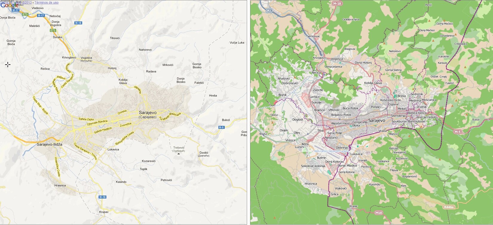
Presenting data on top of a map, via points or areas, is the simplest way of providing potentially useful day to wider audiences. Often a dataset, assuming it has a spatial element, can simply be overlain over existing maps and be used to illustrate any trends or underlying issues. There exists online a choice of mapping providers that can serve as a base layer for existing data, often including easy to use tools in order to prepare and present your data. Google Maps is a popular provider, but it can fall short in areas that are not adequately covered; Sarajevo, for example, is barely shown on Google Maps, but is well mapped by OpenStreetMap. This neatly illustrates the first question that should be asked: Is there map data available for the area I want to cover? Will mapping need to be paid for or will I be able to use it without cost? Careful consideration of your mapping provider will have a great impact upon your final product.
The presentation of existing data is certainly made easier by the revolution in available tools that the Internet has brought, but it does not deal with the potentials of the Internet for collaberation and two-way communication. At the simplest level, but also one of the most power, the tools for displaying spatial data online can also be used to collect new data. Ushahidi, for example, is a powerful platform for presenting data as well as collecting new reports and user feedback. The software, built around the principle of displaying data on a map, was originally produced to monitor post-election violence following the 2008 Kenyan elections. The platform has since grown to be used in a wide variety of situations and is available to non-technical users, or those without the required resources, via the CrowdMap service. Using this software and services users can present data based on first hand reports and sources automatically drawn from webservices such as Twitter. Returning to its roots. recent examples of the use of Ushahidi include monitoring violence around the 2013 election.
Maps are not only powerful tools for displaying data, be it existing data or crowd-sourced information, but tn many situations they are a basic neccessity that is often missing. During the 2013 Kenyan elections the Map Kibera Trust produced election specific maps of Kibera and Mathare, two slum areas within Nairobi, that showed polling stations, ward boundaries and background information about both[5]. Map Kibera state that these maps were produced to inform involved parties about the complex dynamics of the slums and to provide access information to various points of interest. In addition, maps were distibuted to Police and security services monitoring the election day proceedings. The Map Kibera project is a powerful example of the importance of maps; in marginalised areas such urban slums basic tools can be missing or incomplete, but by allowing people to see where features such as polling stations and ward boundaries are, people can much more effectively engage in the democratic process.